


The Independent Games Festival recently announced the finalists for this year’s Seamus McNally Grand Prize, and all of us here at GAMBIT were thrilled to find our game CarneyVale: Showtime included on the list. Showtime, which was developed by the GAMBIT Singapore Lab using XNA and is available for download now on Microsoft’s Xbox LIVE community service, is the spiritual sequel to our summer 2007 prototype game Wiip. We sat down Desmond Wong, a recent graduate of Nanyang Polytechnic who was the lead artist for both Showtime and Wiip, to discuss how art was used to link the growing CarneyVale franchise together.
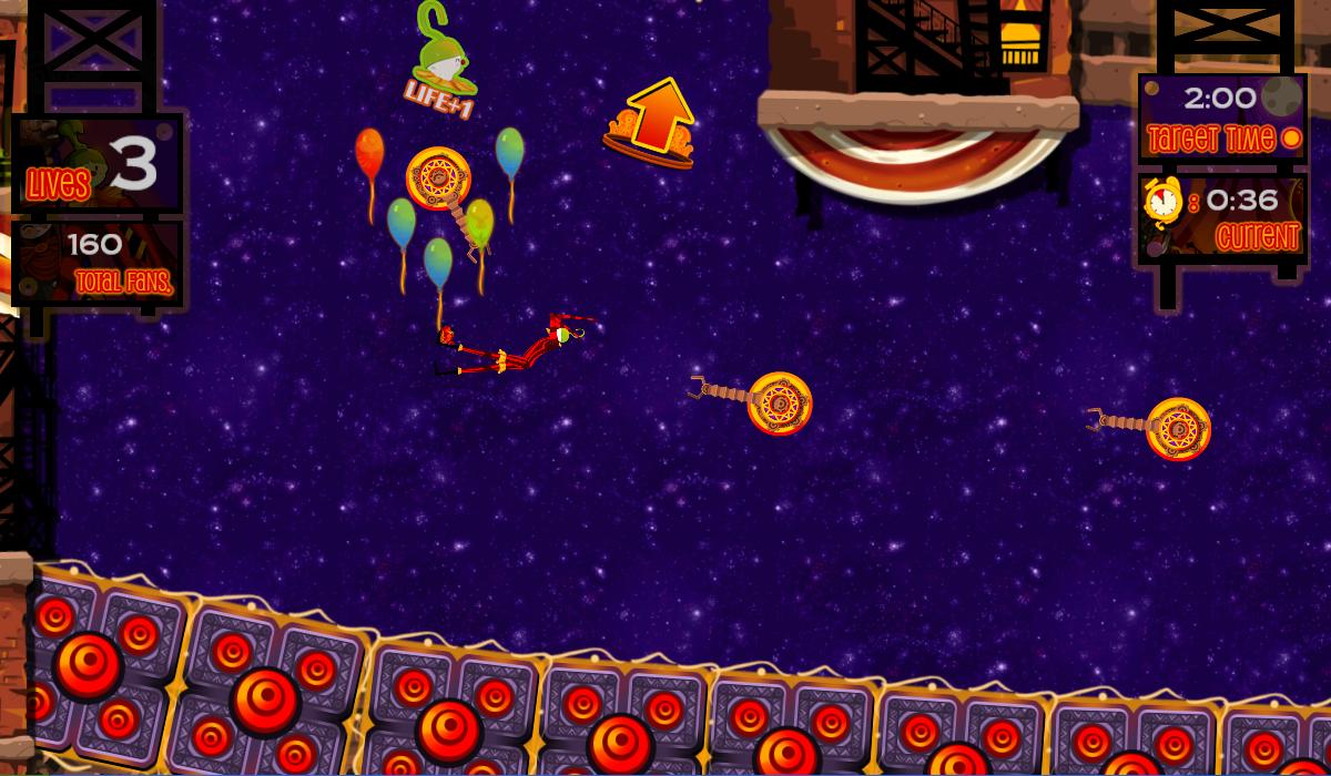
CarneyVale: Showtime
How was the art style chosen for Wiip?
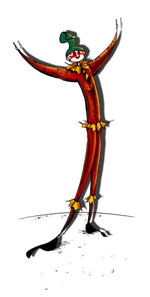
During the concept stages of Wiip, the team was trying to settle on a suitable theme for a whipping game. We tried all sorts of ideas and eras ranging from cowboy western to jungle tribal. However, none of the themes had that special factor to them, they felt too overused and unoriginal. Eventually, the idea of being a ringmaster settled in. We knew it would be cool to be a raging ringmaster with a ferocious whip, and the idea of a mysterious circus quickly came into play.
My initial concepts for Wiip were very dark and creepy, with outlandish animals and clowns. Although interesting, we knew that we needed something cuter and more approachable. Fortunately, the team had another artist who drew really cute and wonderful things. We had her take a stab at the early concepts, and she came up with her own cuter renditions. Eventually, the final product ended up as something both cute and creepy at the same time, a perfect balance between the two.
Art trailer for Wiip
How did the art style change between Wiip and Showtime?
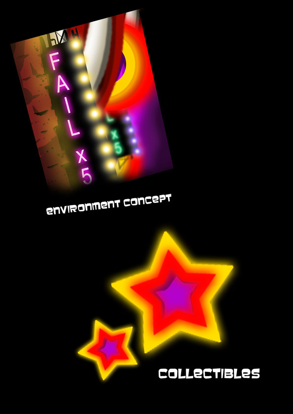
If Wiip was the growing child, then Showtime is the maturing teenager. For Showtime, the art style took a more circus city feel to it. It was literally a city with circus performances on its streets. With that, we could have all assortments of neon signs, glowing lights and bustling color. The genral rendering of the characters also took a more mature turn. instead of kiddy characters, the characters in Showtime are more proportionate and grown. The style of shading also changed, employing more tones of shade and detail.
Despite all the changes, the art style was generally kept to roughly the same feel. The bright and colorful characters and scenery were still present, and the quirky designs never disappeared. It was just an art style evolving as time went on.
Who or what would you cite as the inspirations behind CarneyVale’s art style?
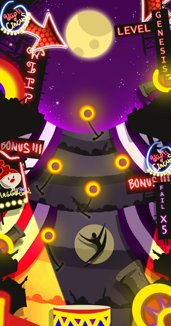
The biggest inspirations for the art style for Showtime were definitely Cirque du Soleil and Las Vegas. I remember the team watching video performances by the Cirque du Soleil troupe, and the costume designs just blew my mind away. Las Vegas was also a huge inspiration to the art style. Being a city circus, I looked to Las Vegas for its neon lights and signboards to give life to CarneyVale. I also used Las Vegas a lot when trying to merge a circus and city together. I would look at photos of that city, and imagine it with circus elements on it, and it would always work.
Artists such as Yoji Shinkawa also give me tons of inspiration. Famous for his work in the Metal Gear series, what I really like about his works is his ability to generate such a distinct style of his own. The way he paints and conceptualises his ideas are what I respect most about this particular artist.
The trailer for Showtime
How did you consciously use the art style to tie Wiip and Showtime together?
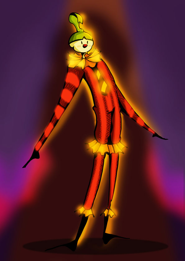
The colors were the main things. When I was working on Showtime, I made sure that my color palette contained all the colors I used with Wiip. This was mainly the reds and yellows, however, I made sure to inject new tones and colors to keep things fresh. I also made sure to include the familiar red and white curtains from Wiip in Showtime as well. This served as a link between the two games, and added a distinct circus vibe to the game as well.
The general details for the items in the world were also kept consistent to tie the two games together. For example, I employed a certain motif in Wiip that I reused on some of the props in Showtime to keep the world whole and seamless. Most importantly, the narrator for Showtime is the main character from Wiip. No better way to tie two games together than that.
What’s your usual workflow like? How do you go about creating a piece of art for the game?
Usually I start with an idea. Ideas can come from anywhere. I got the idea for the Grabber prop by walking past those toy machines where you had to direct a hand to grab the toy you wanted. When I have a general idea down, I take it to the paper and pen. I sketch my ideas out and make sure to do as many variations of it as I can. I also find it very useful to get input from the people around me at this stage when the idea is still fresh and at its infant stage.
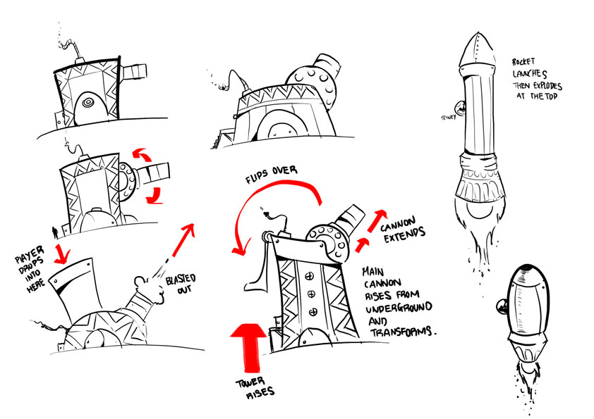
Around this point, I start choosing the best few concepts and proceed to creating art for the game. I use Photoshop to draw out and color the art, and once that is done, I export it out and get it ready to be put into the game. From here on, it’s mostly seeing what works and what does not. For example, the launcher for the missile looked good on paper, but when it was put into the game, it was a little too big and bright. The good thing is that once the art is there, it’s mostly just tweaking to strike the perfect balance between making it look good and work well too.
If you were to do a third game in the series, what new types of imagery would you like to explore?
Wiip took place inside a busy circus tent, and Showtime took place in a bustling city at night. For the third installment, I would really like to see how the game would look like in outer space. We initially wanted to bring Showtime into space for the last few performances, but scrapped the idea in the end. What I really want to try is actually put Slinky in a world where gravity is at its weakest. The image of Slinky doing a double back flip in slow motion while floating upwards is too good to throw away.
Being outer space, I could go crazy with the art style. There are just so many quirky things an artist can design when he isn’t restricted. Imagine shooting through the stars on a flying comet as you are flung through rings of fire in front of a multi-colored nebula. It would be nothing short of legendary.
|

|
|
The winner of the Independent Games Festival’s Seamus McNally Grand Prize will be announced at the Game Developers Conference in San Francisco this March. Keep an eye on this blog for more details!
(Note: this post previously appeared over at GAMBIT co-PI Henry Jenkins’ blog, “Confessions of an Aca-Fan”, at www.henryjenkins.org. For a veritable cornucopia of media studies-related interviews, essays and insights, be sure to bookmark that site.)