


So next weekend is the Convergence Culture Consortium‘s fall shindig, the Futures of Entertainment Conference. I’ve just finished putting together the program for the event, which looks sort of like this:
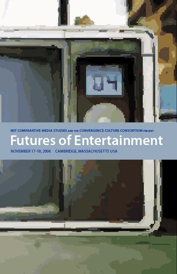
The aesthetic is an attempt to capitalize on what is actually a drawback: the art that C3 manager Joshua Green found for the event (which can be seen on the Futures of Entertainment site, which I also designed) doesn’t exist in anything higher than ~72 dpi at a small size, which renders it pretty much unprintable. There are plugins available that upsample art like that, but they cost too much for our present needs. Therefore, I decided to drop the photo into Adobe Illustrator CS2 (which the department is running in its lab) and use the software’s auto-trace function to produce a vectorized version, which I then blew up to a near-ridiculous size. It’s still pixelated, but the idea is to make it look pixelated on purpose.
There’s more new design work that I’ve been doing for the department which I desperately need to add to my portfolio (such as a redesigned In Medias Res, a promotional poster for the department and other such projects) but they’ll have to wait. There’s also a question in my mind as to how much I actually want to keep updating my portfolio moving forward, but that will, I suppose, hinge on how difficult it is for me to find a decently-paying gig that doesn’t require Photoshop when June rolls around. We’ll see.